February 24, 2015
Using a Pattern Library as a Design Tool

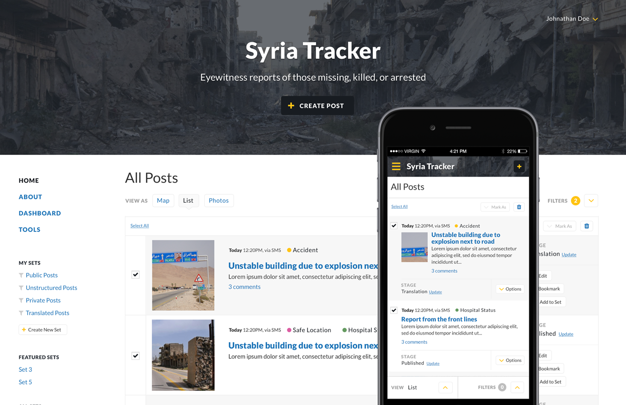
Since joining Ushahidi in the beginning of last month, I have been working on the design and front-end code of the new version of their namesake product, the Ushahidi Platform. Version 2 of the platform was released in 2009 and has been used around the world to help people collect, organize, and visualize data. When V3 is finished, it will have six years worth of improvements, including increased functionality and a shiny responsive design.
The greatest strength of the Ushahidi platform is also what creates the most challenges for the design — its flexibility. The platform could be used to track violence in Syria, or to collect dynamic data from water wells in Afghanistan, or just to make a map of where to get a great burger. Data will be displayed as maps, graphs, lists, image collections, etc. It could be in Chinese, English, Arabic, or even multiple languages at once. And the data can be submitted and sorted in a number of ways; for example via SMS or on a slow connection in the middle of a crisis. Needless to say, there is a lot to consider.
Enter the Pattern Library
Prior to joining Ushahidi, I did primarily client work. We would often make pattern libraries after designs had been approved and coded. We would identify patterns, pull them out of the front-end templates, and organize them into a singular reference point. But with client approval taken out of the equation, we can now use the pattern library as a reference for in-progress design work.
For the V3 design, I’m still using Photoshop to mock-up some views, at some screen sizes. It’s important for me to see that visual hierarchy is maintained when patterns are combined in layouts. But they get coded and added to the pattern library soon after they are designed. The benefits are many:
DRY Design
Most people are familiar with the principle of DRY (“Don’t Repeat Yourself”) programming, and the same thing should apply for design. This can get difficult when you have multiple PSDs and forget to reference every previously created document to check for reusable patterns. In the past I have avoided repetition by creating a working styles PSD, but now the pattern library has taken its place. For example, with all the button variations in one place, it’s easy to see where they can be consolidated and reused.
Patterns as a design palette
We’re not quite ready yet, but in the near-future, I’ll be able to say “adios amigo!” to Photoshop and create a mockup of a new page directly in the browser, made up of existing patterns dropped into an existing layout. And if a page needs a new pattern, I can design that alone, code it, and then put it in. No more painful hours wasted to update one color across multiple PSDs.
Modular QA
Instead of doing Quality Assurance on a full page, we can QA individual patterns. With so many considerations—accessibility, performance, extensible code, languages with different characters & reading directions, multiple devices—it’s a lot easier to test small patterns instead of full pages. We can guarantee that every pattern is bulletproof, and then create pages freely from there.
Open Source CSS
The Sass/CSS lives in its own repository that will then be referenced by the app itself. With the completed pattern library code kept completely separate, future users will be able to fork it and create their own pattern libraries. Maybe someday we’ll even have a collection of themes that can be applied to the app!
After years of doing only confidential client work, the prospect of working on an open source project is super exciting to me. So, if you’re interested, you can follow along with our progress here: Demo & Repository
Writing
March 11, 2022
Interview questions for product designers
March 4, 2022
Six Things I Learned in Six Years at GitHub
August 1, 2018
So you're thinking of becoming a manager...
January 29, 2018